

The Power of Color in Healthcare Branding
Color is one of the most important elements of branding and marketing. It can affect a customer's mood, influence their buying decisions, and even create an emotional connection with a product. When choosing colors for a brand or product, businesses need to carefully consider the psychology of color. Have you ever noticed that different colors evoke different emotions? For example, Adidas' black and white logo is simple and sleek, conveying the company's focus on performance. In contrast, Coca-Cola's red and white branding is playful and friendly, reflecting the brand's personality. Different colors can create different associations in the mind of the consumer, and savvy businesses will take this into account when choosing their branding and marketing materials. And these companies have, through brand development, selected their logo and brand colors to convey specific ideas about their brand personality.
How to choose colors for your healthcare brand
Healthcare or homecare branding is about much more than just choosing the right colors or marketing to the right audience. It's about creating an emotional connection with your patients, clients, and referral sources. And it starts with understanding what emotional attributes you want your brand to convey.
When choosing colors for your healthcare or homecare brand, it's important to keep your audience in mind. For example, if you're branding for seniors, you'll want to avoid using colors that are associated with youthfulness or vibrancy. Instead, opt for colors that create a feeling of warmth and security. Here are a few things to keep in mind when choosing colors for your healthcare or homecare brand:
Your brand's colors should be unique and easily recognizable.
The colors you choose should reflect the values of your brand.
Keep in mind the demographics of your target audience when choosing colors.
By keeping these things in mind, you can ensure that your healthcare or homecare brand's colors reflect its values and appeal to its target audience.
Tips for using color in your homecare branding strategy
Homecare companies are particularly well-suited to using color to create an emotional connection with their customers. For example, blue is often associated with trust and reassurance, qualities that are essential for homecare companies. Similarly, green can be used to communicate healing and growth, while yellow can evoke feelings of happiness and optimism. Of course, it's important to consider the specific connotations of each color before incorporating it into your branding strategy. But by carefully selecting the right colors, you can create a powerful emotional connection with your customers.
Examples of healthcare brands that use color well
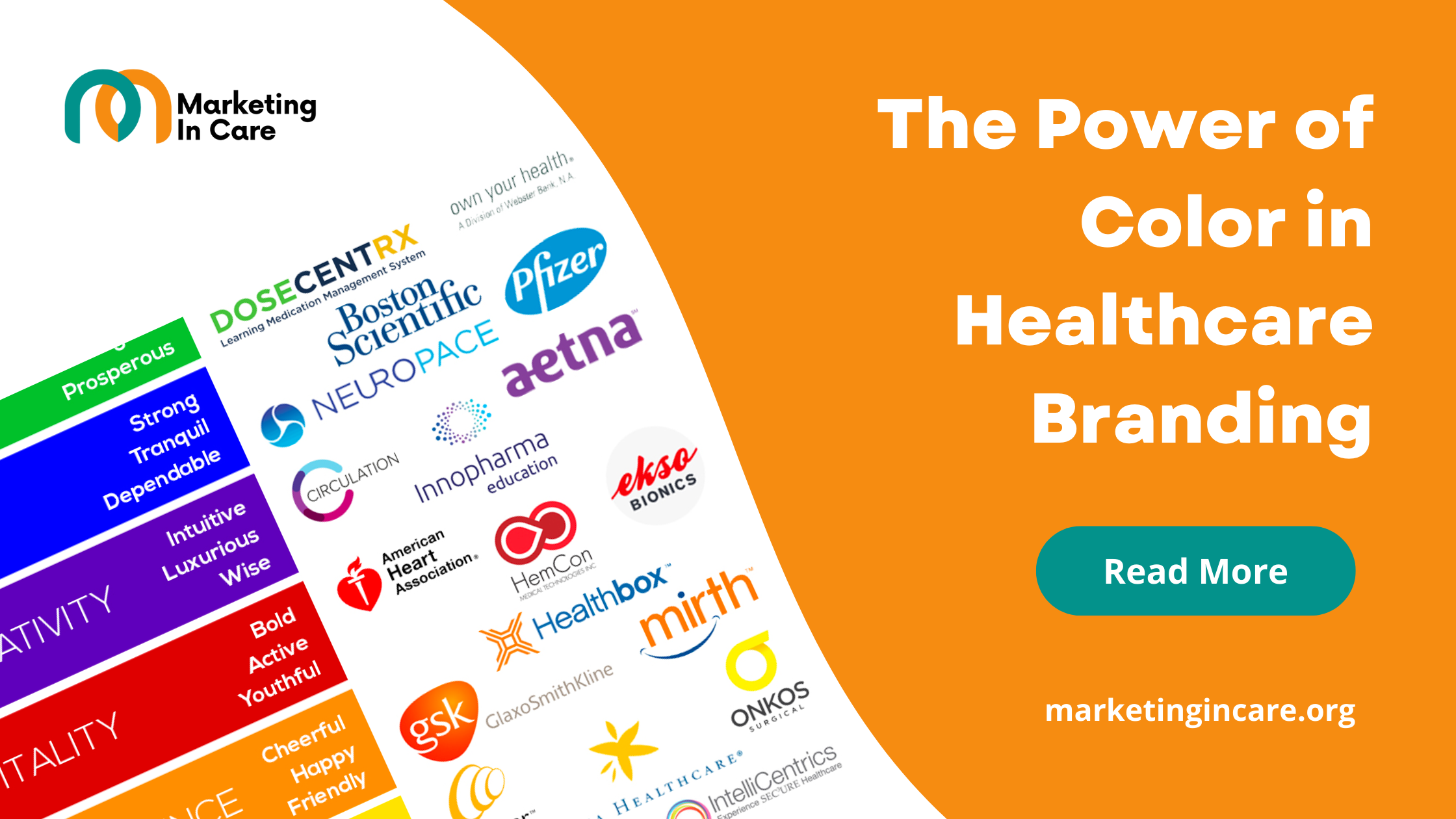
Take a look at the graphic below. These companies have, through brand development, selected their logo and brand colors to convey specific ideas about their brand personality.

American Heart Association is a great example of a brand that uses color well. The American Heart Association’s red dress campaign is to raise awareness for heart disease. The color red is associated with danger and warning. By using the color red, American Heart Association creates a visual that catches people’s attention and gets the message across quickly and effectively.
Another example of a brand that uses color well is Pfizer. The Pfizer brand is blue. The color blue is associated with trustworthiness and dependability. These are qualities that are important to the pharmaceutical industry. By using the color blue, Pfizer conveys to consumers that they can trust its products.
Orange is a color that is associated with energy, excitement, and warmth. For these reasons, GlaxoSmithKline has chosen orange as the primary color for its brand identity. And it seems to be working – the company is now one of the leading pharmaceutical firms in the world.
Our affiliate brands also made sure to utilize these colors’ schematics. Ca Care Association's branding heavily features the color red to symbolize the love and care that they provide. For the Ca Care Association, using the color red in their branding is a way to show potential clients that they're a passionate and compassionate organization that is dedicated to providing the best care possible. At the same time, Elegant Care Villa uses orange and green in its branding to communicate its own unique message. Orange is often seen as a welcoming and optimistic color, while green is associated with growth and renewal. Together, these colors convey a sense of hope and positivity that is synonymous with the care that Elegant Care Villa provides.
The Importance of Consistency
Once you've chosen the perfect colors for your healthcare brand, it's important to be consistent with their use. Consistency creates a feeling of trust and reliability, both of which are crucial in the healthcare industry. When people see your brand consistently using the same colors, they'll begin to associate those colors with your brand. This will help you create a stronger connection with your target audience and differentiate yourself from your competition.
But holistically, healthcare is an industry built on trust. From the moment a patient walks into a doctor's office, they are placing their faith in the hands of strangers. We want to know that the products we're using are safe and effective as well. That’s why most companies in the healthcare arena would agree that they want their audience to associate their brand with a few common emotional attributes that include; trust, dependability, safety, knowledge, and cleanliness. This leads a majority of healthcare or homecare companies to use blue in their logo design based on the widely accepted color theory—an art and science unto itself—and psychology.
These are all attributes that instill confidence in the quality of care you provide. But how do you go about conveying these emotions through your branding? You're not alone if you're feeling worried about adding color to your branding. It's a big commitment! But there's no need to fret - by taking the time to establish your brand and create an irreplaceable company, you'll be ready to take on color with confidence.